What Makes A Stanley Cup Champion? More Hockey Interactives To Explore

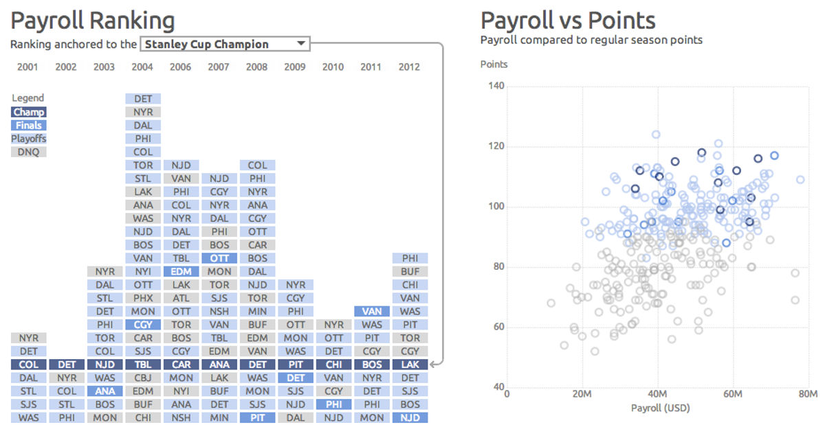
Continuing our industry-leading coverage of interactive hockey infographics, the charts above are a selection from an excellent piece of data viz by Dark Horse Analytics, which explore the relationship between payroll/attendance/offense/penalties and team performance.
The chart on the left, based on this piece of baseball work by Craig Robinson, is particularly clever. Teams are ranked by payroll (or whichever variable you choose), but anchored so the Stanley Cup winners occupy the same row. It's a good visualization of some pretty intuitive stuff about hockey—teams that score a lot, have a good +/-, and avoid penalties tend to have the most success—but what's more fascinating is the outliers it picks out, like the 2012 Kings (29th in goals scored) and the 2007 Ducks (1st in penalty minutes). Payroll doesn't make as big of a difference as you'd guess—just look at the Rangers.
The charts are a showcase project for a data visualization company, so they're very dense—maybe a little too dense, if you haven't played around with this sort of thing before—and worth a look.
Related







Britney’s HCL Saga Shows How Murky High Stakes Poker Is

5 Fights the UFC Should Make After Rosas Jr. vs. Barcelos

- MLB Playoff Futures: Three Best Bets for the 2026 Postseason
- Eagles vs. Bears MNF Week 3 Betting Total Picks and Predictions
- Rams vs. Broncos Sunday Night Football Best Betting Pick
- MLB Best Bets: Three Picks for the Final Day of the Regular Season
- UFC Vegas 121 Underdogs: Why Alatengheili Is Worth a Look at +300
- UFC Vegas 121 Predictions: Best Bets for Saturday’s Fight Card
- UFC Vegas 121 Line Movement: Two Betting Favorites Have Completely Flipped