These Beautiful Charts Show How Well Your NBA Team Spreads The Ball

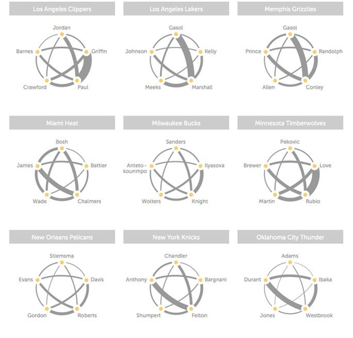
In another cool application of SportVU technology, Andrew Bergmann of the Hangtime blog on NBA.com has put together some beautiful charts showing how often different NBA starters pass to each other.
The line thicknesses above represent the relative number of passes between two players (in either direction; not all of these are two-way streets). They're impressively intuitive graphics, giving you an immediate sense of the NBA's biggest combos (Rubio-Love, Paul-Griffin), which teams spread the ball well (Indiana, Houston, Miami, and Orlando, among others), and which teams might be having some issues (Denver, Milwaukee, New Orleans, and Philadelphia—you'll also notice that the Trail Blazers continue to avoid Robin Lopez).
Go check out all the teams over on Hangtime; they're worth a look.
[ NBA.com | via Fast Company]







Britney’s HCL Saga Shows How Murky High Stakes Poker Is

5 Fights the UFC Should Make After Rosas Jr. vs. Barcelos


- MLB Playoff Futures: Three Best Bets for the 2026 Postseason
- Eagles vs. Bears MNF Week 3 Betting Total Picks and Predictions
- Rams vs. Broncos Sunday Night Football Best Betting Pick
- MLB Best Bets: Three Picks for the Final Day of the Regular Season
- UFC Vegas 121 Underdogs: Why Alatengheili Is Worth a Look at +300
- UFC Vegas 121 Predictions: Best Bets for Saturday’s Fight Card
- UFC Vegas 121 Line Movement: Two Betting Favorites Have Completely Flipped