The Los Angeles Chargers Have Used Three Different Logos In Two Days

![Via [object Object]](https://images.deadspin.com/tr:w-1200,fo-auto/nhmduqc99e7qozgykgot.jpg) Via [object Object]
Via [object Object] The Chargers announced their move to Los Angeles all of three days ago, and they’ve apparently already changed their main logo three times.
The day after announcing the upcoming move, they debuted something that suspiciously looked like a blatant rip-off of the Dodgers’ logo. After being widely derided on social media—until the NFL deleted the original tweet showing off the logo—they changed the color scheme:
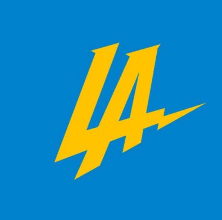
And now they’re apparently going in a different direction, with a Twitter avatar that now displays a stylized “Los Angeles Chargers” sans lightning bolt imagery:
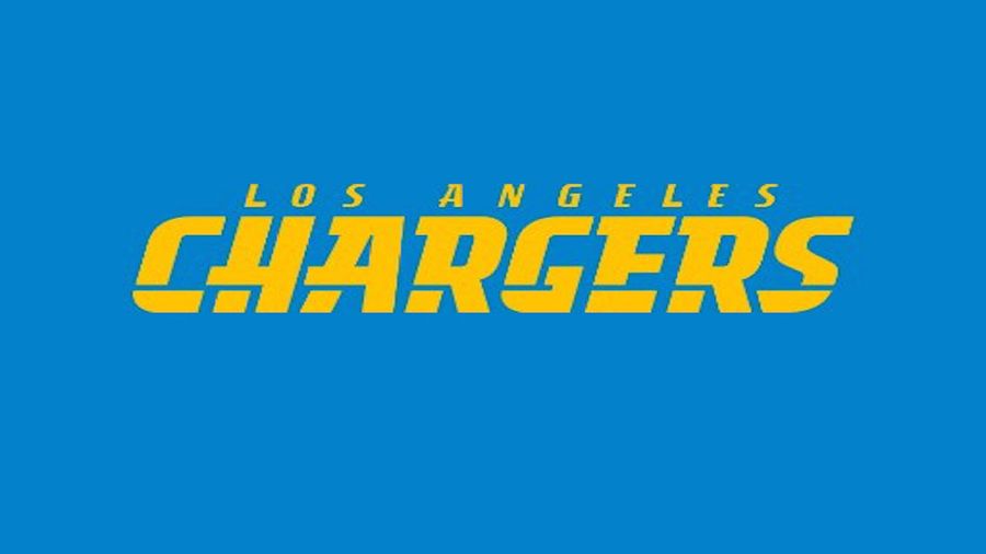
Farewell, sweet little bolt.
[H/T Michael Gehlken)
Latest







Britney’s HCL Saga Shows How Murky High Stakes Poker Is
Tue Sep 29 2026

5 Fights the UFC Should Make After Rosas Jr. vs. Barcelos
Tue Sep 29 2026


Latest Betting
- MLB Playoff Futures: Three Best Bets for the 2026 Postseason
- Eagles vs. Bears MNF Week 3 Betting Total Picks and Predictions
- Rams vs. Broncos Sunday Night Football Best Betting Pick
- MLB Best Bets: Three Picks for the Final Day of the Regular Season
- UFC Vegas 121 Underdogs: Why Alatengheili Is Worth a Look at +300
- UFC Vegas 121 Predictions: Best Bets for Saturday’s Fight Card
- UFC Vegas 121 Line Movement: Two Betting Favorites Have Completely Flipped