The Chargers' Logo Died On Its Way Back To Its Home Planet

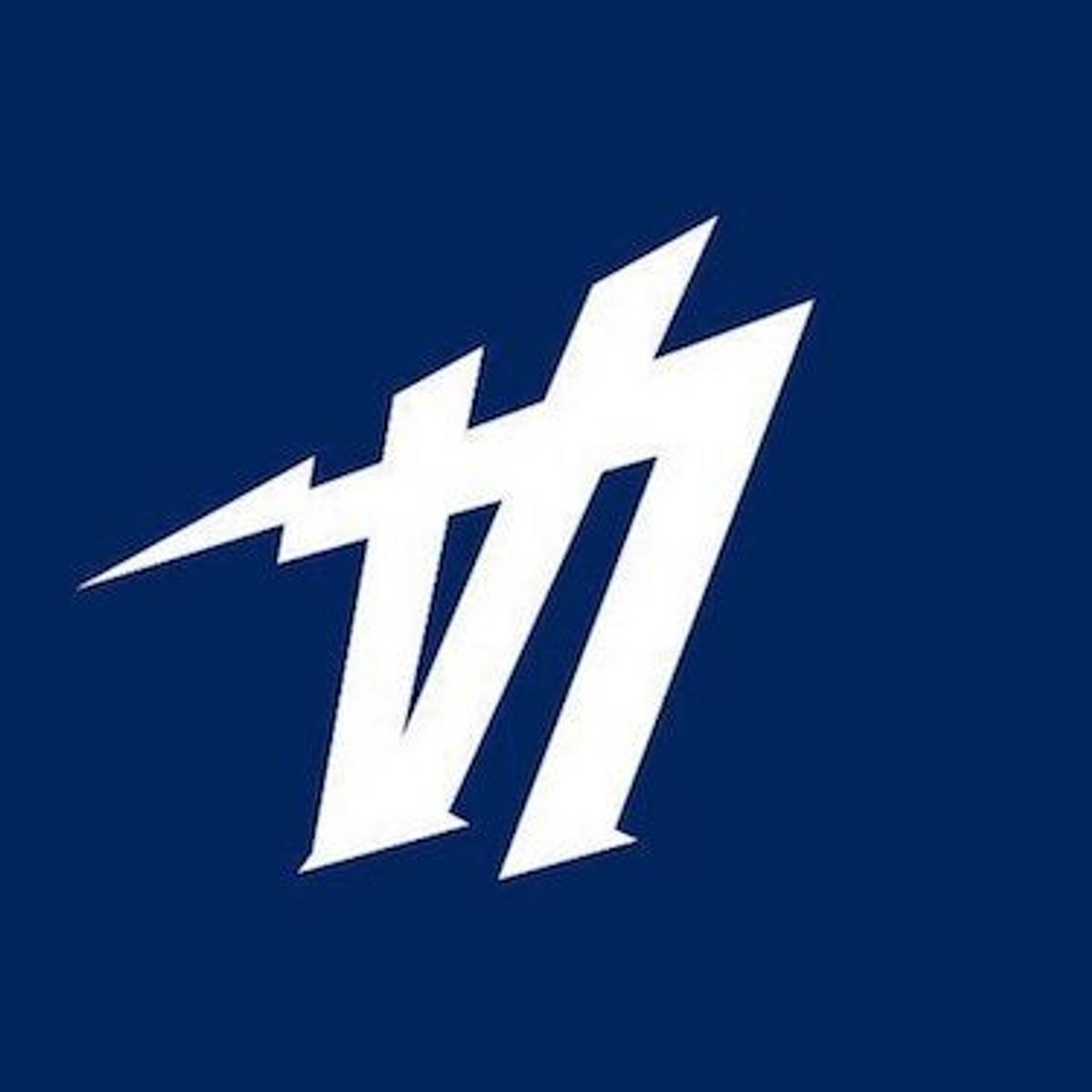
Those were a heady few days, weren’t they, after the Chargers announced their move from San Diego and then soft-launched an L.A. logo that looked like the Dodgers logo stuck its dick in a wall socket. It was mocked by hockey teams, booed by Los Angeles basketball fans, color-swapped and mocked again, and now, apparently, consigned to the dustbin of history.
Goodbye, you sad, silly logo that looked like it belonged in a movie where they couldn’t get the rights to real NFL trademarks.
“The logo that was revealed on Thursday was meant to help launch our brand into the market and supplement — not replace — our official team marks,” Chargers president of business operations A.G. Spanos said in a statement provided to PFT. “Clearly, we miscalculated how the logo would be received, and we’ve taken it out of the rotation.”
On their website, the team is still going with the classic lightning bolt logo, and a Chargers wordmark that deemphasizes the whole “Los Angeles” bit. Really winning those hearts and minds up in L.A, guys.






Britney’s HCL Saga Shows How Murky High Stakes Poker Is

5 Fights the UFC Should Make After Rosas Jr. vs. Barcelos


- MLB Playoff Futures: Three Best Bets for the 2026 Postseason
- Eagles vs. Bears MNF Week 3 Betting Total Picks and Predictions
- Rams vs. Broncos Sunday Night Football Best Betting Pick
- MLB Best Bets: Three Picks for the Final Day of the Regular Season
- UFC Vegas 121 Underdogs: Why Alatengheili Is Worth a Look at +300
- UFC Vegas 121 Predictions: Best Bets for Saturday’s Fight Card
- UFC Vegas 121 Line Movement: Two Betting Favorites Have Completely Flipped