Someone Invented A Better Way To Broadcast The World Cup

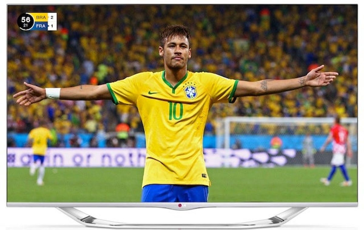
Dutch designer Guus ter Beek doesn't really like what he sees when he watches watches World Cup games on ESPN, so he and his colleagues went and invented a new, better way to broadcast the games.
From FastCo Design:
"When we have a closer look at ESPN we immediately notice the soft gradients and the black and purple colors not looking very appealing; they are popping in our face and shouting," [ter Beek] says. And ESPN isn't the only one; ter Beek checked out lots of sports channels, and says, "They always had either too much drop shadow, or frivolous elements, and an abundance of gradients." This conceptual design offers something different: flat graphics, bold colors, and a carefully curated emphasis on certain bits of information.
Ter Beek's idea also comes with a variety of icons that can periodically be thrown up on the screen to relay important information:

Yeah, I'd definitely watch a lot more soccer if it looked as pretty as this.







Britney’s HCL Saga Shows How Murky High Stakes Poker Is

5 Fights the UFC Should Make After Rosas Jr. vs. Barcelos


- MLB Playoff Futures: Three Best Bets for the 2026 Postseason
- Eagles vs. Bears MNF Week 3 Betting Total Picks and Predictions
- Rams vs. Broncos Sunday Night Football Best Betting Pick
- MLB Best Bets: Three Picks for the Final Day of the Regular Season
- UFC Vegas 121 Underdogs: Why Alatengheili Is Worth a Look at +300
- UFC Vegas 121 Predictions: Best Bets for Saturday’s Fight Card
- UFC Vegas 121 Line Movement: Two Betting Favorites Have Completely Flipped