Atlanta Hawks Unveil Redesigned Pac-Man Logo

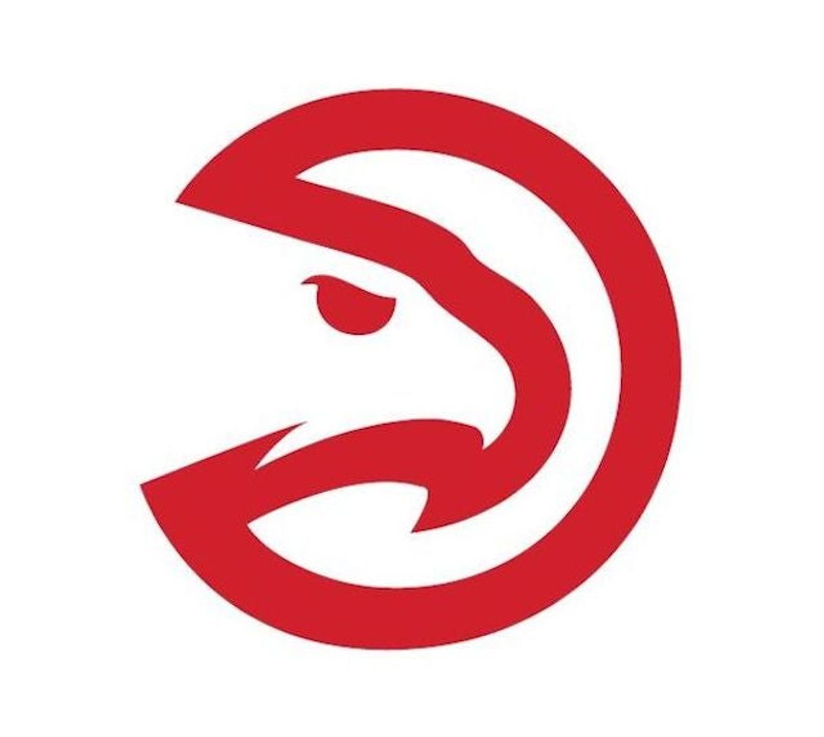
Did you know that the Atlanta Hawks used to have a secondary logo that was Pac-Man themed? Well, they did! And now they've reprised the logo and given it a fancy new design.
Above is the updated version of the Pac-Man logo, and here is what the old one looked like:
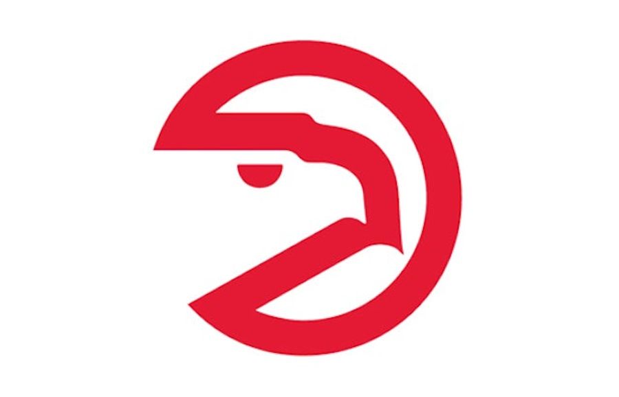
I don't really get it. I mean, yeah, it's the silouhette of a hawk that also looks like Pac-Man, but why? And as our own Albert Burneko put it, both kind of look like an emphysemic Pac-Man hocking up a blood loogie. The new one just looks like it also wants to kill someone.
[ AJC]
Latest





Britney’s HCL Saga Shows How Murky High Stakes Poker Is
Tue Sep 29 2026

5 Fights the UFC Should Make After Rosas Jr. vs. Barcelos
Tue Sep 29 2026

Latest Betting
- MLB Playoff Futures: Three Best Bets for the 2026 Postseason
- Eagles vs. Bears MNF Week 3 Betting Total Picks and Predictions
- Rams vs. Broncos Sunday Night Football Best Betting Pick
- MLB Best Bets: Three Picks for the Final Day of the Regular Season
- UFC Vegas 121 Underdogs: Why Alatengheili Is Worth a Look at +300
- UFC Vegas 121 Predictions: Best Bets for Saturday’s Fight Card
- UFC Vegas 121 Line Movement: Two Betting Favorites Have Completely Flipped